Dunking the Sun

Photography

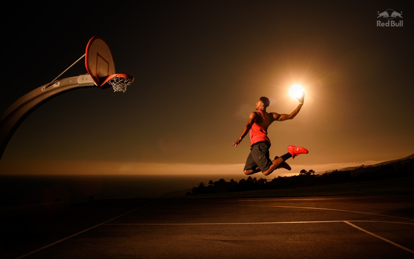
This was another photograph that I saw in Communication Arts that I just had to share. This was taken by Dustin Snipes for an ad campaign for Red Bull Media House. It features NBA player, Anthony Davis, in the middle of dunking a basketball sun. I found this shot to be very smart. I like how the sun is purposely being used as a ball. I like the tone of the shot, too. It really brings out an evening feel to the photograph, even though they were taken in the early morning. The photo also attracts basketball lovers and sports lovers as well. However, I don’t really understand how this shot relates to Red Bull. Red Bull’s tagline is that it “Gives you wings,” except I don’t see that in this photo. I guess because Davis is in a jumping pose, you get the idea of him flying, but even then, I don’t see anything that screams Red Bull to me. Overall, I found this photograph to be really cool because you never really see anyone dunking the sun ever. The photographer really made great use of his location (San Pedro, CA), and the time of the day, as well.

To see more photos from this ad campaign click here.

Photograph taken off of the Red Bull website.

display.jpeg

Hari & Deepti & Their Paper Dioramas

Uncategorized

I first came across the work of Hari and Deepti almost a year and half ago on Pinterest. They both are originally from India, but moved to Denver some years ago. Hari is a trained graphic designer and illustrator, and he was the senior designer for MTV Networks India. Deepti is an interaction designer for a leading telecom company. Together, they have created outstanding art with paper cutting and light, as well as sculptures out of paper clay. Paper is their medium because they find that since stories have many shades and a certain depth to them, paper has the precise qualities to reflect and to interpret them.

It is their firm belief that:

“Paper is brutal in its simplicity as a medium. It demands the attention of the artist while it provides the softness they need to mold it in to something beautiful. It is playful, light, colorless and colorful. It is minimal and intricate. It reflects light, creates depth and illusions in a way that it takes the artist through a journey with limitless possibilities.”

I love how their work isn’t geared to one audience. They are really universal, and attract people of all ages. They’ve done amazing things with light and paper! Their works are all so intricate and detailed. However, at the same they have a minimalistic quality to them. Their work has been used as book covers and have been featured in many publications. When I first saw their work, I thought that all of their work was done in Illustrator. It was only when I did some more research on them that I found out that they hand cut paper to make up the design and used light to not only be a light source, but also a coloring effect, as well. They’re so skilled in the art of the paper cutting, and it’s just incredibly awesome what they’ve done with it!

Check them out here!

Instagram (Most frequently updated!)

Black Book Gallery

Facebook

Phipps Project Update #4

Summer Project: Phipps

Sorry for this late project update! I know in last week’s update, I said that I decided I wanted to focus on the Jazz in the Garden event. Well, over the weekend, I got some new inspiration for the Tropical Forest Congo event/exhibit. I kept seeing the trailers for the new Tarzan movie, and got the idea of the jungle vines as connections. In my mind, I kept associating vines as an object connecting the wildlife and plants in the rainforest. I started to sketch somethings out, and finally got an idea of the integrating the type with vines. I’ve been looking at some typefaces for this project, too, off of the Adobe Typekit website. As for the booklet, I’m kind of debating what size I want the booklet to be. I’m not going to exceed the 6×6” parameter, but I don’t want to be a square booklet. I’m making some mockup booklet forms to figure out what size I want it to be.

Below, I have three mockups of the event posters with some comments on them, too. I’d appreciate some feedback and comments on them, even on my preliminary sketches from the prior updates as well. To be honest, I got stuck on the Jazz in the Garden event once I started it on the computer. I also realized I that couldn’t find any more information about the event either. With the Tropical Forest Congo exhibit, I found much more information about it and I also went back and saw the photos I took when I was there.

The Literal Merging of Heinz & Kraft

Photography

This is photograph really caught my eye! At first, I couldn’t really understand why a small bottle of the Heinz Ketchup was going through a jar of Miracle Whip. This photograph was taken by Glen Gyssler. The image went along with an article for Chicago magazine called ‘What the Kraft-Heinz Merger Means for Chicago.’ I really admired the fact that this photograph showed the literal merging of Heinz Ketchup with Kraft’s Miracle Whip. On his website, Gyssler showed how he “illustrat[ed] the merging of [two] food giants.” It’s really cool how he approached this still life. He called it Condiments of Fury! This image does emit a sense of anger and wrath and goes along swimmingly well with the article’s tagline of, “Local jobs are at stake as Kraft merges with Heinz. But the payoff could be sweet for investors,” as well as the whole article’s content. I’m just blown away with how this still life photo was taken! This photograph is bold, amusing, and thought-provoking.

Check out how Glyssler took the photo here! See his other works here!

Photograph taken from Glen Gyssler’s website.

heinz.kraft.build1.4

Fruit Explosions by Timothy Hogan

Photography

This photograph series is aptly named Fruit Explosions. They were taken by photographer, Timothy Hogan, for the late shoe designer, Vince Camuto. I first thought that these photographs were part of a fruit juice advertisement/campaign. But wasn’t even close! They were taken originally for a shoe campaign concept, but they weren’t used in the end. I honestly don’t understand how these photographs relate to footwear. I can’t even find anything else about the concept in order to understand the relationship between the exploding fruit and Vince Camuto’s shoes. Aside from that, I found images to be really cool, and what was even cooler was how he took them. He first took the fruit and basically hacked the heck out of it. He then stuck them on what seemed to be a screwdriver. After that, he threw the juice of that particular fruit with their seeds, too. I’m assuming he timed his camera in order to take the photographs nicely, without any shakes. I really like these photographs because they make the fruit look so juicy and succulent. It makes you thirsty. It would’ve been interesting to see how these images would pertain to shoes.

Watch this super short video to see how he took these photos! It’s only 13-seconds!

To see more of Timothy Hogan’s work click here.

Photographs taken from commarts.com

London Flavours Show the Flavours of London

Packaging

Earlier this week, I received Communication Arts’ Photography Annual. I’ve been tabbing the photographs that I found interesting, as well as some packaging examples and interviews. The next few posts will be about a few of them. 

I came across the packaging for the English potato chips, London Flavours. The packaging was designed by the London-based design firm, Adaptable and the client was Food Store International. They wanted to target the Middle East with this packaging. Food Store International had been exporting food brands there for almost 25 years and felt that it was the right time to export their own brand. The packaging was the based on the concept of a London-themed brand. The designers at Adaptable decided to show the brand’s identity and tone through products, themselves, and their tastes.

What I found absolutely interesting was the fact that chip flavors’ were related to the London locations featured on the packaging. This was purposely done in order to breakaway from traditional chips packaging in London. I liked how one solid color differentiated each of the chip flavors, as well. I also liked how each of the images are treated in the same manner. The image sections on the packages also double as a focal point and breaks up the space. I approve of the serif typeface and how it makes the packaging look sophisticated. However, I wonder if there’s aspect of this new packaging that relates back to their Middle Eastern audience? If so, shouldn’t they feature that on the front? Overall, I really admire how this potato chips’ packaging, doesn’t actually look like potato chips’ packaging. That’s what sets it apart from others.

Photographs from commarts.com

Phipps Project Update #3

Summer Project: Phipps

In last week’s project update, I said that I had three summer events in mind for the poster for the Phipps Project. Over the week, I narrowed down three events to just one event: Jazz in the Garden. I feel like I have a lot visual references for this particular event. I also ended up sketching more concepts for this event, too.

The new additional concepts include:

  1. The idea of flowers blooming out the music/instruments
  2. Still playing with idea of a party
  3. Typography coming out of instruments (like music notes coming out instruments)
  4. Flowers not making up the instruments, but are inside of them (like masking an image)

Now with the membership booklet, I’ve been working on some layout sketches for it. In regard to the booklet, I want to use the images of flowers and leaves that I’ve gathered and recreate them into interesting patterns/textures for each page. I’ve also come up with the idea of essentially “framing” the booklet with the images and the content. I’m also starting to write the content for the booklet as well.

I’m still sketching out my concepts for each project. Below are just some of the sketches I’ve done this past week.

The Rebranding of Juicy Juice

Packaging

In the past month or so, I recently started to drink Juicy Juice again. I remember trying find the juice in the aisles of Giant Eagle, and when I finally found it, I was surprised. Juicy Juice had a new package and a new look now. It didn’t have the image of Arthur the Aardvark on the packaging anymore, nor did it have the blocky word mark on it either. After doing some research, I found out that Juicy Juice had a whole brand makeover, so to speak. In July 2014, Harvest Hill Beverage Company acquired the Juicy Juice brand, and approached the brand strategy and design consultancy, Product Ventures. Harvest Hill wanted them to redo the entire graphic elements of the packaging including the brand mark. They wanted the packaging to attract today’s millennial mom. According to the Product Ventures website, the packaging “embraces authenticity and goodness without losing flavorful appeal, delivering on the promise of “goodness made juicy.””

I’m not a mother, but I am an aunt to two young kids, and I would most definitely buy them Juicy Juice based on this new packaging. The packaging clearly shows the information I want to see first and foremost, instead having to look on the back of bottle/box. They’ve laid out the information on the front nicely and shows nice type hierarchy with the different font sizes. The images of the apples also are enticing and really makes you think they are juicy. I approve of the new brand mark of Juicy Juice as well. The typography of the word mark is no longer blocky, but seems to be a slab serif typeface. I personally think that slab serifs are sophisticated, and as a consumer, it looks appealing to the eye unlike the previous typeface. The brand mark is also very simple and I could easily see it working in different sizes. They’ve seem to have stuck with one type family on the packaging as well. I think that is a good thing their using one consistent typeface because the use of another typeface would’ve made the package too busy looking. The whole new look for Juicy Juice seems to be working well for them.

Product Ventures’ Website:

http://www.productventures.com

Article About Juicy Juice’s Rebranding:

http://adage.com/article/advertising/juicy-juice/299834/

Photos From Product Ventures’ Website


A Redesigned Look For Skin Care

Packaging

I came across this redesigned packaging for Proactiv skincare on Pinterest. This packaging was designed by a designer on Behance, Kate Carmack. She designed the new bottles to appeal a teenage audience by using a “more sophisticated look of a beauty product in place of its current ‘medical’ appearance.” I love the minimalist approach to these bottles, as well as the geometric numbers to show the 3-step process of the product. I’ll admit! It took a moment, for me, to realize that the three packages featured numbers on them. However, Carmack intentionally designed them to look like they were interlocking with each other. She did this to suggest the idea of each step being like a puzzle piece. I also like the color scheme of the entire packaging. The scheme is similar to the actual bottles’ colors, but these pops of color really attractive. I think this is smart packaging for a skin care product. It’s young and hip, and overall attractive. It sucks that Proactiv is using a “grown-up looking” package for their product when they want to attract teenagers. They should really consider changing their current packaging to something like Carmack designed in order to attract a younger crowd.

Sources:

https://www.behance.net/gallery/Proactiv-Packaging/9651651