Phipps Project Update #2

Summer Project: Phipps

Happy Monday everybody! I have been brainstorming constantly for the membership booklet and the summer event poster for Phipps Conservatory. In the last update, I mentioned that I was dissecting the membership guide I took from my visit. After I did that, I defined all the benefits of the regular and enhanced membership packages. I took those lists and narrowed down the key benefits. Finally, I consolidated them into concrete value statements.

From there, I started to brainstorm some concepts for the booklet:

1. Playing with images and typography

2. Having content on top of images

3. Having type peeking out from images

4. Images as borders

5. Having content on opaque solid background with image in back

There are a lot of summer events going on at Phipps. I narrowed them down to three events that I thought were interesting: Jazz in the Garden, Tropical Forest Congo Festival, and Environmental Film Series. I did bunch of mind maps on these events. As a result, I came up with some concepts and even started to sketch some of them out.

Jazz in the Garden Concepts:

  1. Dancing vegetables/plants to jazz music/player with an instrument (a garden party)
  2. Emphasizing New Orleans as a Jazz hub, using a garden as the setting
  3. The streets of New Orleans during a celebration
  4. Vegetables/plants/fruits making up/or as an instrument
  5. Vegetables/plants/fruits turning into an instrument (vice versa)

Tropical Forest Congo Festival Concepts:

  1. Emphasizing the tropical forest environment using the reference pictures and dressing them up as if there’s a party going on
  2. Emphasizing the indoor waterfall in the forest and playing with idea of type in the water
  3. Having the typography form within leaves
  4. Highlighting a tropical flower
  5. Having a tree leaves make up a bigger tree and the tree dressed up as at a festival

Environment Film Series Concepts:

  1. Taking forms associated with the environment and manipulating them into film reels/film strips
  2. Trees branches made of film strips
  3. Watching movies in the park/drive-in movies
  4. A play on film reels, film strips, and movie tickets

This first section of images contains my brainstorming and my sketches which are divided up into each project and then each event. The second section of images contains some of my inspirations for the booklet and the poster. Click here to see my Pinterest board filled with much inspiration for this project!

Estrella Damm & FC Barcelona

Uncategorized

I came across a short article on the homepage of the Communications Arts website about a new ad campaign for a beer called Estrella Damm. Estrella Damm is brewed in Barcelona, Spain, so they asked a Spanish-based ad agency, ABM Serveis de Comunicació, to create an ad campaign. They wanted the campaign to show how this beer was the official beer of FC Barcelona. FC Barcelona is one of the major soccer clubs in the world. It also happens to be one of my favorite teams. ABM enlisted Lorenzo Petrantoni, an Italian illustrator, for his incredible illustrations that, “[c]aptured the energy, spirit, and vigor of one of football’s major teams.”

From the looks of these ads, they attract three audiences:

1. Barca fans

2. Estrella Damm drinkers

3. Barca fans who drink Estrella Damm

Petrantoni interestingly combined the type and images together in his illustrations to create an awesome ad. After checking out his website, I found that all of his illustrations have the same visual style. He strategically placed the text and the images to create the space. I like how the type and the images in the illustrations form a bigger image. The varying sizes of the type and the images make that bigger image. This, to me, makes the ad engaging and as a result, made me check out all the aspects of the ad. These advertisements have successfully communicated the beer as FC Barcelona’s official beer.

Comm Arts Article:

http://www.commarts.com/exhibit/estrella-damm-print-ads

Lorenzo Petrantoni’s Website (really cool illustrations!):

http://www.lorenzopetrantoni.com

Dada Photomontages & Today

Art History, Movie Posters

The Dada movement came about as reaction against violence of World War I. The movement challenged art itself and included elements of strong negativity and destructiveness. In Meggs’ History of Graphic Design, it stated that, “Dada artists claimed to have invented photomontage…” This technique took found photographs, and manipulated them to create an unpleasant closeness to each of them. It also made the viewer create weird/forced associations amongst the images. The pioneers of photomontage work during the Dada movement were Raoul Hausmann and Hannah Höch. They had been excelling on this medium since 1918.

Today, we still see this technique in use in our current movie posters. The posters that immediately come to mind, for me, are Star Wars, Indiana Jones, Captain America, and Iron Man. Each of these posters combined images directly taken out from the film, images taken just for the film, and background images. Although the images aren’t dramatically juxtaposed like Dada montages, they are planned out like Dada montages. They are manipulated, as well, to have to create an interesting movie poster to entice audiences all over the world. Dada photomontages were the quintessential advertising technique, of that time, for the violence and destructiveness of war. Just like that, movie posters have been, and will continue to be, one of the key advertising methods for movie promotion all over the world.

The featured image is called Fashion Show by Hannah Höch.

Burgatory To Go!

Packaging

This morning I woke up with a craving for a veggie burger and a milkshake from Burgatory. So later this afternoon, I satisfied my hunger and was surprised to see Burgatory’s take-out packaging. In case you haven’t realized it yet, I ordered my burger and milkshake to go. The whole Burgatory brand was created and designed by Wall-to-Wall Studios (W|W). They’ve been around for almost 24 years now and have offices here in Pittsburgh and in Honolulu. For Burgatory, W|W decided to “[design] an integrated branded experience that elevated every touch point, including the food, to become the hottest restaurant in the region.” Burgatory’s designed elements include: the visual branding (logos and taglines); the on-site accessories (menus, gift cards, and take-out packaging); and the environmental details (signage and wayfinding) (Wall-to-Wall Studios). Wall-to-Wall Studios’ concept/idea for Burgatory was to be “wit[ty] and [have] just the right amount of irreverence to be remembered and craved.”

Now what I’ve always liked about Burgatory was their use of different typefaces that are just so in your face! They really have a fun time with typography! So today, when I saw the to-go packaging, I was amazed by how they enhanced a simple cardboard box and a paper bag. Both elements are mostly type heavy, but also integrate some imaging and simple icons. The typography and the icons are red and that really appeals to a person’s hunger and pops out on the box and bag. The take-out packages also feature witty headers and sayings using loud typefaces and really appeal to a person’s humorous side as well. Along with being loud and red, the typefaces have a grungy look and feel to them. This visual style works well with the textures of the box and paper bag and further enhances them. The type is also strategically placed out in different positions on the box. This makes them visually interesting and allows you to move your eyes around on the box and on the bag. On the whole, the packaging is rememberable and witty like the concept stated. It entices to an audience with their humor and the most importantly, their hunger.

Their take-out packaging is working very well for them. Like with all of their other design elements, Burgatory is appealing to people with an appetite and a humor. They leave the audience with wanting more to eat, and as result, wanting to come back time and time again. The brand itself communicates well as a burger and shake bar. In my opinion, Burgatory’s branding and identity really makes it “sinfully good.”

P.S. “Sinfully good” is one of their taglines if you didn’t know that 🙂

Burgatory_bag

Sources:

https://www.walltowall.com/pages/burgatory

https://www.walltowall.com/news_posts/wall-to-wall-studios-design-for-burgatory-wins-print-regional-design-annual

My Trip To Phipps

Summer Project: Phipps

Almost two weeks ago I drove down to Phipps Conservatory and Botanical Gardens. This was only my second trip down to Phipps. The last time I went there was almost three or four years ago with my sister and our cousin. This trip down there really took me out of my comfort zone. I haven’t really driven down to the Squirrel Hill/Oakland area in a couple of years. The last time I drove down there was with my mom in a different car. Prior to going there, I had done some research about Phipps and I had a few questions, too. I wanted to know when it would be a good time for to me visit and if I could take my tripod with me. I found out that Mondays and Tuesdays were the least crowded days and that the Conservatory was the quietest between 3 PM and 5 PM. I wasn’t allowed to take my tripod with me because I had to be member in order to do so. Also, I would have had to call ahead of time, too. So once I got I there, I paid for my ticket and grabbed the membership guide and the general guide that were available at the ticket counter. When I made my way upstairs, I was greeted by two of the curators there. One of them walked in with me and she explained to me how to make my way through here. She also pointed out to me, Romero. She told me that Romero was a corpse flower and that it last bloomed 3 years ago. It didn’t bloom yet when I was there and I’m thinking of going back to check that out again. So anyway, I took some notes along the way and a boatload of photographs as well. I found myself being to drawn to different flowers and the leaves with different colors and textures. I also liked how Phipps integrated their art collection with their plant collection. My favorite places there were the Tropical Forest Conservatory (indoor rainforest!) and the Sunken Garden (couch made of flowers!). After roaming around taking photos and notes, I ended my trip by visiting the indoor cafe there. While there, I looked at my photos and started to sketch some things out.

When I got home, I imported all of my photographs and started tagging them according to my notes and to what I thought would be good visual references. I also created a Pinterest board for this project and started to pin examples of floral typography, brochure layouts and visual approaches/directions. I’m still looking around for color schemes right now. I have been searching for different floral based color schemes. I also have been dissecting the guides and making mind maps based on Phipps as well as the rooms and gardens there.

I took about 428 photographs that day. Now below is just a fraction of the photos I took, but they each are key moments from my trip. I have also included my notes and some of my sketches from that day. As always, click on the images to enlarge them!

Easy Exotic Frozen Food Packaging

Packaging

So I was doing some grocery shopping one day and I was walking around the frozen food aisles when I caught a glimpse of some food packaging that reminded me of the former Mexican restaurant, Chi-Chi’s (I miss their food!). I back tracked my steps and took out the box. The food packaging was for Padma Lakshmi’s Easy Exotic frozen food line. What caught my in the first place was the photograph of the rice dish (spicy black beans and rice). It wasn’t the signature of Lakshmi or even her face. It was the food itself and right in the left corner was second most important information I saw: vegan. So it was a no-brainer for me then to buy it!

When I examined the packaging again, I noticed several things. Straight off the bat, I understood that this package was to appeal to foodies anywhere in the US. However, I couldn’t really get whole exotic concept from the packaging. Yes, the bright blue color and the pattern seem exotic, but they really aren’t screaming exotic to me. As a result, it was hard for me to get the intended message. The whole box looked and felt homemade the wooden texture and the handwritten looking content. I felt that most well designed part of this box, aside from the front, was the back panel. The content and images were laid out nicely and allowed the white space to move my eyes across the box easily. I also noticed that the box used at least four different typefaces. The box had an old style serif typeface (dish name), a humanistic sans serif typeface (“Padma’s,” cooking instructions, and story), and I what believed were two casual script typefaces (“Exotic Easy” and handwritten looking content). There was a consistent placement and use of one of the casual scripts, the old style serif, and the humanistic sans serif on the back panel and the side panel with the cooking instructions on it. This subtlety displayed some text hierarchy on the side panel and back. In addition to that, I noted that two of the panels lacked some sort of design element. Overall, this box did some nice things with typography and layout design and it most definitely attracted a food-loving audience. However, I would change some things on this package to make it work with the concept more.

I would use more floral patterns and incorporate more splashes of color to enhance the package’s exotic concept. Right now it emphasizes too much on Lakshmi’s homemade experience and not enough on the exotic part of the food. I would also change the amount of typefaces this packaging used. Instead I would stick to one serif typeface for any of the headings and one sans serif typeface for any of the other written content. I would let the handwritten elements stay on the packing because it adds a personal element to the packaging. Finally, I would move the nutrition facts from the one side panel to the bottom panel with the barcode on it. I would then design this side panel to have a similar layout like the other one and have more written content on it. Or maybe, that entire panel could have Lakshmi’s little note on it, instead of on the back. This would allow the back have more white space and the note to make more breathing room. I think this redesigned package would appeal more to food lovers.

*Padma Lakshmi’s Easy Exotic food packaging is branded and designed by Brandmade Design Co. (http://brandmadeby.us)

Photographs taken by Akaashmi Mishra; Feature image from Google Images

Ai Weiwei: China’s Rebel

Uncategorized

Ai Weiwei was born in Beijing, China in the year 1957. He is a human rights activist and an outspoken critic of China’s authoritarian regime. In April of 2011, Weiwei was arrested by Chinese authorities and was isolated from the outside world for almost three months. After his release, the government prohibited him from leaving Beijing for one year and he was also not allowed to travel without government permission. As a result, he became China’s symbol for the struggle of human rights in China.

Ai is greatly influenced by the works of Andy Warhol, Marcel Duchamp, and Jasper Johns. In fact, he spent his formative years as artist in New York City during the ‘80s when Warhol was considered a god. In a Smithsonian Magazine article, he basically said that this experience allowed him to understand how to “combine his life and art into a daring and politically charged performance that helps define how we see modern China.” He has gained an international audience with his work. He doesn’t really have a particular visual style either in any of his work. He tends to venture into different mediums such as sculpting, photography, architecture, and even social media to deliver his social message.

So why am I writing about him? Because I’m going to see his new exhibit at the Andy Warhol Museum next week. I came across his work for the first time when I was doing my preliminary research on art censorship for my English final last year. I like how all of his works have some social message behind it. I also admire the fact that he doesn’t stick to one platform or genre to get his message out to the world. One of my favorite works of his is Sunflower Seeds (2010). This was an installation made up of millions of small, identical but unique works that were hand-crafted in porcelain. Ai decided to have these seeds made out porcelain because it is widely associated with China. Ai’s message for this installation was to take closer look at the whole “Made in China” sensation in the world and to take a look at the geopolitics of cultural and economic exchange. Ai Weiwei is a brave man to stand up against the harsh Chinese government with his artworks. He truly is China’s rebel artist.

Here are some his works:

Note: The featured image is Ai Weiwei’s Dropping a Han Dynasty Urn (1995).

Sources:

http://www.smithsonianmag.com/arts-culture/is-ai-weiwei-chinas-most-dangerous-man-17989316/?no-ist

http://www.smithsonianmag.com/arts-culture/ai-weiwei-on-his-favorite-artists-living-in-new-york-and-why-the-government-is-afraid-of-him-30139964/

http://www.tate.org.uk/whats-on/tate-modern/exhibition/unilever-series-ai-weiwei-sunflower-seeds

http://www.theartstory.org/artist-ai-weiwei.htm

The Inkquisitive Amandeep Singh

Uncategorized

Amandeep Singh (aka Inkquisitive) is a London-based graphic illustrator and artist. I came across his work by one of older sisters, Pooja, a few years ago. Since then, I have been following his work via his Facebook page and his Instagram account. Singh graduated from the University of Hertfordshire in 2009 where he studied illustration. He does a lot of editorial art as well as religious art, but is mostly inspired by today’s pop culture. He became famous after R&B singer, The Weeknd, was made aware of Amandeep’s awesome illustration himself. The Weeknd then responded online on the work by asking, “Who did that, dope art.” He has also been featured in some YouTube videos of Superwoman.

What I really like about his work is his visual style. All of his illustrations are all done in bright and vibrant ink colors to create a watercolor to them. I love how his work ranges from great Sikh warriors to hip-hop legends to movie stars to President Obama. His work tends to draw attention from no particular audience nor does his work stays in one genre category. Amandeep’s works have no particular message either. He’s just paying his tribute the subject in a creatively different way.

Overall, I think is his work is amazing. He portrays each subject of his, be it an actor or a religious figure, in a unique way using ink. He’s described his work as being a “controlled chaos” and as being “imperfectly perfect.” That being said, I don’t find anything I’d want to change in his work because the imperfections of this work created the end results.

Check out more of his work here.

The Battle of the Book Covers

Uncategorized

I was grocery shopping at my local Giant Eagle when I decided to stop and look at book section there. I was delighted to see that they had the book Me Before You*. I really wanted to read this book, so I picked up the book cover on the left. But I was walking away, I spotted the book cover with the stars of the movie. I quickly placed the first book down, and took the cover with Emilia Clarke and Sam Claflin instead.

Now there wasn’t anything wrong with the original book. I really like the typography on the cover. I like how the letters move your eyes across the cover. The designer displays excellent hierarchy with letter height changes and color. I think the designer wanted to attract women who love a good romance novel with the colors. The title really pops on the page, especially the words ‘me’ and ‘you’. This cover is more typography driven and I love that, except it doesn’t really show or represent anything to me about the story.

The cover with the movie’s stars, however, interested me more. Why? Well, it gave me a preview of the movie and the ability to imagine the main characters nicely as I read. I personally prefer to buy the books with movie adaption’s stars on it so I can picture them instead of a blank face in my head. I also like the typography on this cover as well. I don’t really like serif fonts but this was an exception. The simple ligature between the letters ‘m’ and ‘b’ move your eyes to the rest of the title words. This cover still draws attention a female audience, but also to an audience who like the stars in their other roles (Game of Thrones and The Hunger Games). I happen to fall in both categories.

Both of these covers make great use of the space. They both move your eyes across the page thanks to their respective typefaces. They show text hierarchy and emphasize the important words on the page. However, one cover is type heavy, whereas, the other one greatly combines text with imagery. I like both covers, but the addition of imagery on the front cover made a great difference in my book purchase.

P.S. I may have also bought book because Khaleesi and Finnick Odair were on the cover! 😉

*Both covers were for Penguin Books, but the original cover is designed by de Vicq Design.

A Movie Poster With An Attitude

Uncategorized

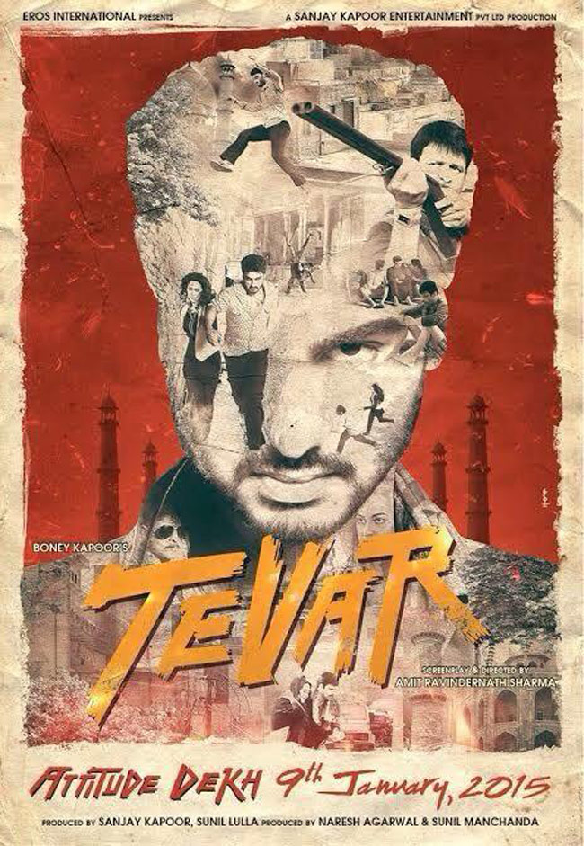
When I first saw this poster for the Bollywood movie, Tevar (English: Attitude), last year I was amazed. I was really fascinated to this poster because of the multiple exposures making up the face the movie’s hero. I thought it was really cool and different from any movie posters (Hollywood and Bollywood) I’ve seen. Interestingly enough, the poster was designed by the actor in the poster himself, Arjun Kapoor. He designed the poster so he could appeal to a teenager/young adult movie audience. I would say he was successful because it made me want to watch this movie even before I watched the trailer itself. Also, the whole poster, to me, screams attitude with rustic color palette and the brush like typography. It’s young and bold and exactly what one would expect with title like Tevar. But as amazing as this first poster was, the following promotion posters for this movie weren’t as appealing. I would have liked to seen a series of this particular poster with the heroine’s and villain’s face being made up of multiple images. I think that would have been more appealing than the other promotion posters.

P.S. The movie wasn’t all too great. The songs though were really good!

tevar-story-size_650_101414105553