In Defense of the Spider-Man: Far From Home IMAX Poster

Movie Posters

HEADS UP! There may be some spoilers from Avenger’s Endgame. Beware!

Last week, IMAX released their poster for Spider-Man: Far From Home, and I’m pretty sure I’m one of the few who actually likes it. Why do I know this? Well, fans and critics have been deeming this poster as a “hilariously unexciting copy-paste job”1 and “a cluttered mess”2. The main criticism from fans and critics alike seems to be lack of sleekness and sophistication which were seen in the IMAX posters for Captain Marvel and Ant-Man and the Wasp. As a result, fans on Twitter have been roasting the poster and have been offering up their own renditions. Some of them, I admit, are truly well-designed and intriguing, but I still beg to differ. 

I believe the critics are too blinded by their poor opinion to really understand that this poster, along with the rest of the MCU’s (Marvel Cinematic Universe) Spider-Man film posters, are a part of a design system. You see, in Timothy Samara’s book, Design Elements: A Graphic Style Manual, he says that, “The vast majority of designed works—printed, interactive, and environmental—are systemic in nature….” He also asserts that, “[Design] approaches, derived from the narrative concept … are the primary rules to follow in some way,” and elaborates further that this  “in some way” line formally allows a designer to reinterpret the primary rules to fit their vision, just as along as these variations are “intrinsically related to the element or relationship they vary.” This new IMAX poster applies four consistent design elements that not only show up in the earlier Far From Home poster, but also in the Spider-Man: Homecoming posters of 2017, as well.

The first element is the use of passport stamps in both the first Far From Home poster and this new IMAX poster. Look close enough at the poster for Far From Home from January, and one can notice the passport stamps for Berlin, Germany; London, England; and one indistinguishable city on the bottom right corner. In the IMAX poster, the stamps show up again for the same cities with the addition of Italy’s Venice and the Czech Republic’s Prague. Interestingly enough, Italy and Prague show up in the first poster as stickers on Spidey’s mask. This brings me to the second repetitive detail: the appearance of city landmarks on the posters. On the poster featuring Spidey’s mask, one can see the stickers of landmarks in London, Berlin, Prague, Switzerland, and Venice. On the IMAX poster, some of these landmarks show up in the form of line drawings. It’s arguable that these places are repeatedly referenced on the posters since some of them show up in the Far From Home trailer. 

The most blatant reoccurring design element is a hand-drawn/“sketched out” effect. This detail is first introduced in the Homecoming posters with the spray-painted Spidey mask replacing the second “O” in the word “homecoming”. The hand-drawn effect is heavily used/emphasized in the Homecoming IMAX poster which essentially is a play of a notebook page of Peter Parker. The Homecoming IMAX poster also features the Spidey mask twice as a part of the title and as a penned out one, too. Fast forward two years later, and this effect shows up yet again in the new IMAX poster with the landmarks and reappearance of the Spidey mask. 

The last consistent design element is the overall, collage look between the Homecoming IMAX poster and the Far From Home IMAX. This collage look has been written off twice (respectively) as too “scrapbook-y” and badly designed. However, I think it’s perfect for the MCU’s version of Peter Parker/Spider-Man. To me, they scream young, playful, and strategic. The hand-drawn aesthetic and the respective bright, bold color schemes adds youthfulness to the poster. Both posters are strategic as Peter Parker/Spider-Man is featured predominantly in both, while there is enough presence of the semi-major main characters (heroes and villians) of the each respective film such Tony Stark/Iron Man, Nick Fury, Adrian Toomes/Vulture, and Quentin Beck/Mysterio. Unlike the past Spider-Man films, this Spider-Man is, by all means, still technically a teenager even after Thanos was killed the second time around. That being said, it shouldn’t come as a surprise that this poster has a young, playfulness look and feel to it. 

I think it’s hard to expect a sophisticated superhero poster for a teenage superhero who (excuse my language) went through shit. Spoiler alert!!! First, he’s decimated by Thanos on Titan. Second, he missed 5 years in his life. Lastly, Tony Stark is dead. Peter’s father figure/mentor is dead after snapping Thanos and his army at the end of Endgame. Tom Holland’s Peter Parker/Spider-Man is, to me, a mix of Tobey Maguire’s Spider-Man and Andrew Garfield’s Spider-Man. This new IMAX poster exudes this new Peter Parker post-Avengers Endgame. He’s still youthful, but he is a bit more jaded and grown up now. He now has legacy to live up to and carry on from a man he loved 3000.

Image Sources:

Spider-Man: Far From Home posters sourced from Marvel’s Twitter page.

Spider-Man: Homecoming poster sourced from Google Images.

Referenced Articles:

  1. http://collider.com/spider-man-far-from-home-imax-poster/
  2. https://www.fastcompany.com/90364370/fans-hilariously-bad-spider-man-far-from-home-imax-posters

Elen Winata

Uncategorized

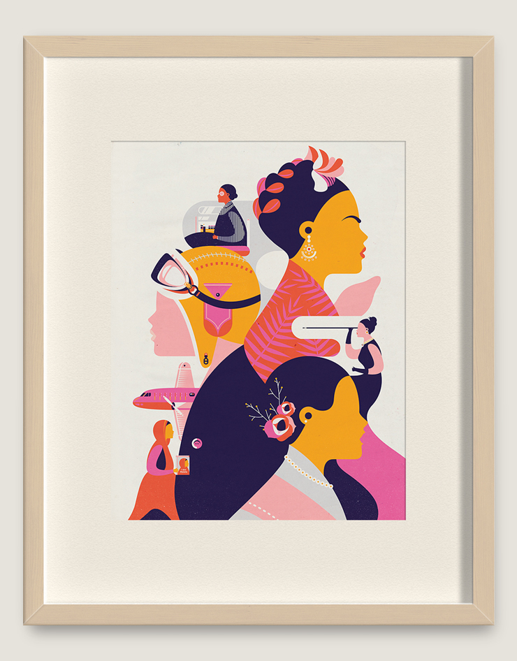
One of my favorite designers is a woman by the name of Elen Winata. She is a Singapore-based, award-winning freelance designer and illustrator. She studied graphic design at The Art Institute of New York City. She formerly worked at the Singapore-based design firm Kinetic and the ad agency DDB. After working at both respective places for two years each, she decided to turn into a full-time freelance designer. Some of her clients include Harper’s Bazaar, Starbucks, Google, and National Geographic. 

She became one of my favorite designers when I read her online interview with Communication Arts last year. I immediately noticed how similar we both are. We both considered ourselves as quiet kids in our respective childhoods. We both have a fondness of drawing. For her, drawing was a way “to escape from the daily grind and as a way to comfortably get [her] thoughts across.” As for me, drawing started out as a hobby to get me through my first visit to India, and later turned into a form of relaxation. In her interview, she said that, “choosing to major in art at college was one of the easiest decisions” she ever made. Majoring in graphic design was one of the easiest decisions I ever made, as well, once it became increasingly clear that I was not cut out to be a fashion designer. 

I just love her work! As stated on her website,“Her works are known for their clean lines and vibrant colours, which are held together by simple but thought provoking ideas.” Those clean-cut lines and the bright, bold colors are exactly what drew to me her work after reading about her. Her illustration style has been an influence to me in my own work. As an American-born Indian, I admire her adapting approach to different design work which she says is a result of being “raised in a multicultural society and having moved between different countries.” She attributes this in helping her “better understand a brief from different backgrounds and apply the design style most appropriate for it.” I feel like that I somewhat lack that understanding, but hopefully, one day with more experience, I too will be able easily adapt my design approach as a project demands. And finally, I love her philosophy of following your gut, making your own mistakes, and defining success in your own terms rather than someone else’s.

Check out more of her work here!

Source: https://www.commarts.com/fresh/elen-winata

Image: From Communication Art’s website

Art Deco & Today’s Posters

Art History

Art Deco is decorative art style that uses precise and bold geometric shapes and curves, as well as strong colors and lines. Now I’m not a big fan of Art Deco, but I can’t deny the fact that Art Deco works have the ability to bring back the “Roarin’ 20s” look and feel. It’s very retro! Be it architecture, posters or patterns, the Art Deco style reflects the playfulness and merriment of the 1920s’ that continued up until World War II. We can still see Art Deco in places like the Chrysler Building in New York and Hollywood Boulevard in Los Angeles. But in the world of poster design, it reemerged with period films like The Artist in 2011, and then with The Great Gatsby remake in 2013. Both of these movies are heavily influenced by Art Deco since they take place during height of this movement. As a result, this is reflected in their respective posters. The movie poster for The Artist features a condensed decorative typeface that is similar to other Art Deco typefaces. The posters for The Great Gatsby show the dramatic curves and the strong lines that define Art Deco. This is also mirrored in the typeface as well. The text is bold and blocky, and connected to the rest of the poster by the mirrored vertical and curved lines in the letterforms. Both of these posters give off a rich and retro feel to them. However, I find that The Great Gatsby emulates the Art Deco style more because of the setting and the plot.

Sources:

https://99designs.com/blog/creative-inspiration/art-deco-a-strong-striking-style-for-graphic-design/

http://www.mtv.com/news/2770606/art-deco-in-film/

Images from Google

Pop Art & Packaging

Art History, Packaging

After visiting the Warhol this week, I remembered how much I like Pop Art. Pop art is based on our pop culture and the mass media. It’s complete opposite of traditional fine art. It uses bold and bright colors and recognizable imagery. Thanks to Andy Warhol, Pop art found its way into package design. We are all familiar with his Campbell’s Soup cans/boxes and Brillo boxes. Warhol once said that, “Pop art is about liking things,” and it’s because of his liking of Campbell’s Soup that he made his iconic works. He felt that, “it [Campbell’s Soup] was the quintessential American product: he marveled that the soup always tasted the same, like Coca-Cola, whether consumed by prince or pauper.”

Fast forward 56 years to this century, you can still find Pop art in packaging and advertising. Take this packaging concept for the Goode Coffee Company. It was designed by Allan Revah who wanted to show the energizing qualities of coffee and caffeine with strong, expressive visuals. The coffee cups and bags have abstract geometric patterns and shapes on them. They’re enhanced by the loud, bright colors, too. They clearly have a Pop art style to them. I personally think they’re reminiscent comic book works of Roy Lichtenstein. Even though the packaging differs from one another, they still manage to belong to one company’s product.

Sources:

http://www.trendhunter.com/trends/artsy-coffee-cups

http://www.warhol.org/education/resourceslessons/Campbell’s-Soup–Ode-to-Food/

https://www.behance.net/arevah

Andy Warhol & Ai Weiwei

Art Outings

I had the best time today at The Andy Warhol Museum! Get this! 7 floors of Andy Warhol’s and Ai Weiwei’s works, side by side. Amazing! Whereas, the Ai Weiwei exhibit at Carnegie Museum of Art was just his Circle of Animals/Zodiac Heads, the Warhol featured almost all of Weiwei’s works. I got to see two of his works which I shared in the my previous blog post about Weiwei: Dropping a Han Dynasty Urn (1995) and Tea Brick (2006). However, the Dropping a Han Dynasty Urn wasn’t displayed as photographs. According to the description, Weiwei recreated his iconic work in legos, and in a pixelated form, to argue the distribution of images by digital technologies. It was really awesome to see Warhol’s and Weiwei’s works side by side. It allowed me to see how much of an influence Warhol was to Weiwei. Each floor “focus[ed] on the parallels, intersections, and points of differences between their practices.” I saw how one person represented the 20th century (Warhol), while the other represented this current century (Weiwei). I was surprised to see how their respective works on Mao were similar to one another. They both featured his face and his signature stance, except they were executed with different materials. Weiwei painted his Maos’ with oil on canvas, while Warhol used acrylic paint and silkscreen ink on linen fabric. At the end of my visit, I came to a conclusion.  Ai Weiwei and Andy Warhol both produced work on controversial subjects during controversial time periods. If you guys have the chance, I highly recommend seeing Weiwei’s exhibit at Carnegie first, and then see this second exhibit at the Warhol!

Check out my post on Ai Weiwei for a refresher!

Check out my trip!

P.S. This got me annoyed! Can you tell what’s wrong? Also, I’ll put up captions later. I’m having some technical difficulties.

IMG_4953

Phipps Project Update #5

Summer Project: Phipps

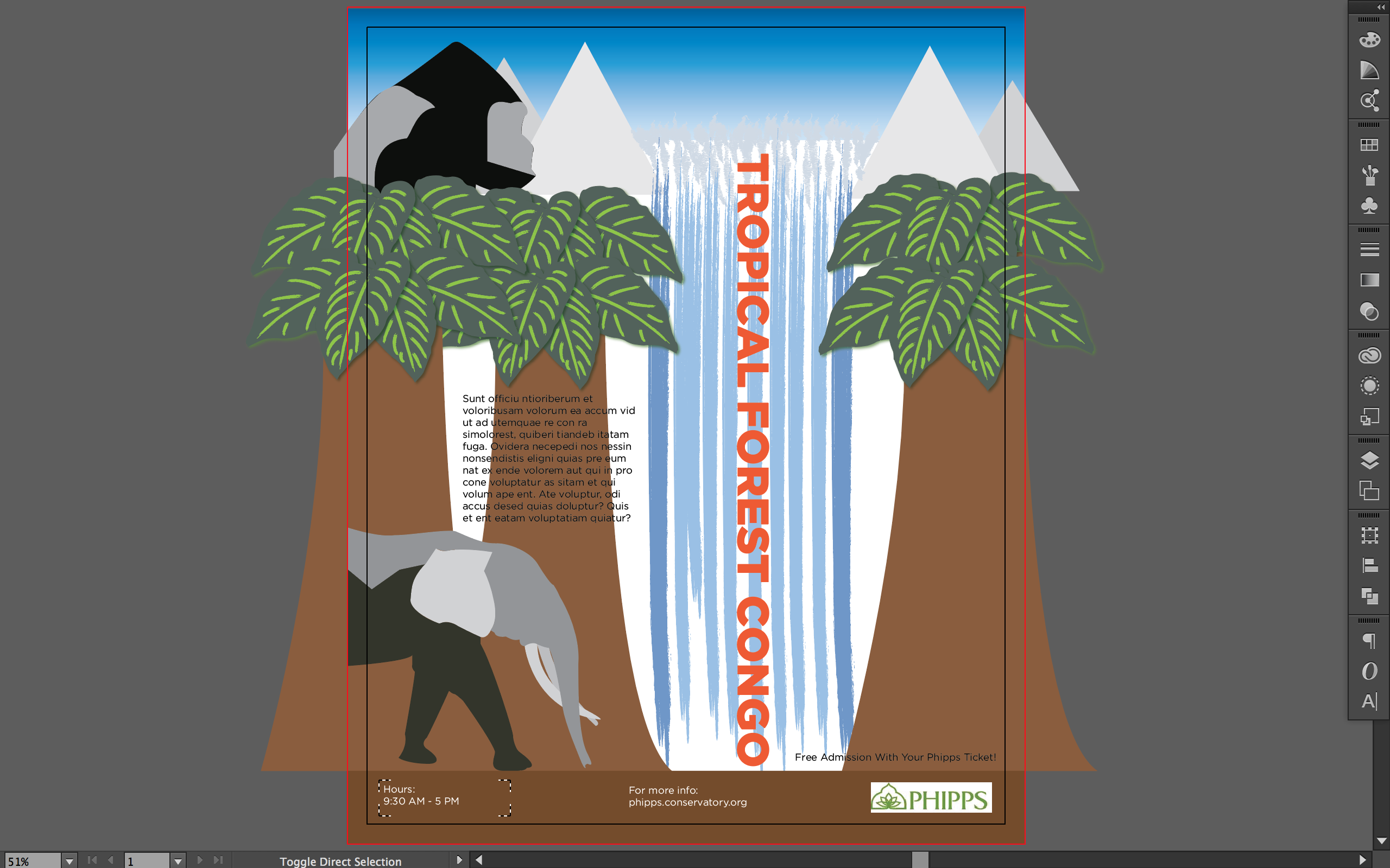
Hello! This is what I’ve been working on this past week, along with my booklet. I’ve noticed that I’ve forgotten to tell all of you my intended audience for my event poster. I want to attract both adults and kids. I did some more sketching on this event, and came up some more interesting ideas. I decided to incorporate aspects of the Congo Rainforest and Basin. Those aspects not only include trees and flowers, but animals (Mountain Gorilla, Forest Elephant, Bonobo, and Chimpanzee) and waterfalls as well. I want the audience to essentially “enter into the jungle” by looking at the poster. They should get an idea of what kind of habitat they will be seeing in this exhibition, and understand what animals inhabit the Congo Rainforest. Now in this poster, I still need to add a tree bark texture (I found a demo!) to the trees. I also need to draw in a bonobo (the closet animal to us humans!), a chimpanzee, and lianas (vines). I want the poster to scream Congo! As for the booklet, if you could so kindly check back in a day or two, I’ll have a booklet that I’ll be proud to show off to you all.

Screen Shot 2016-07-19 at 12.00.47 AM

Sketches:

Ricola’s “Unwrap Your Voice” Packaging

Packaging

This packaging was used for a Ricola Herbal Cough Drop ad campaign in Germany, sometime around 2012-2013. The campaign’s concept was “Unwrap Your Voice,” and it was created by the German agency, Jung Von Matt. The campaign was also a three-way collaborative effort between Jung Von Matt, the Scope Digital Studio, and illustrator Julien Canavezes.

The illustrations were really the highlight of this ad campaign. They’re fun, whimsical, and witty! They make you want to “unwrap” these cough drops, so you can see the whole illustration. Looking at his other illustrations, it seems that he uses a similar visual approach in all of his illustrations. They have a certain lifelike aspect to them, and yet, at the same time, they have an unconventional quality as well. His illustrations brightened up the idea of eating a cough drop for a sore throat. I find it amazing that he did all of these “faces” in Illustrator. Each of these “faces” asked the consumer to do one thing, “Unwrap [Our] Voice.”

It sucks that this ad campaign didn’t run in the US. It’s a really different approach to cough drop packaging, and is especially different to Ricola’s packaging here. I buy Ricola cough drops. If this packaging was used in the US a few years ago, I would have just bought them regardless having a sore throat. But they didn’t use this packaging here, and I just have the plain, boring packaging. Ugh! They would have attracted so many different audiences here because of the fact that these “faces” have hilarious expressions on them. I guess we’ll never know how consumers here would have reacted to them.

Source: https://ifitshipitshere.blogspot.com/2013/06/ricolas-unwrap-your-voice-packaging-ad.html

Check out the other illustrations of Julien Canavezes here: https://www.behance.net/toyzmachin

You can check out his website, but it’s all in French 🙂

5680158de8a813894ab259b7526a5b4f

Hair Curling Pasta Packaging!

Packaging

I came across this pasta packaging on Pinterest. These packages are designed by Moscow-based designer Nikita Konkin. He used a minimalist design approach to pasta packaging, and as a result, makes them stand out against other pasta packaging on the shelves. His concept was to let people see parts of the product itself, and that to in a fun and interesting way, incorporating the different pasta shapes. I found these packages to be fun and innovative. They really are one of a kind. They show what pasta you’re getting, the cooking time, and instructions clearly. The black and white box really stands out against the pasta color. The typeface Konkin chose also reflects the playfulness of the box and the pasta shapes, as well. Along with the pasta shapes, the texture of the pasta makes it actually look like hair. I guess the display cut-out helps the consumer to get the image of hair, too. I can’t find anything to change about these packages. Konkin has successfully designed pasta packaging that isn’t like the rest of the pasta packaging that already exists.

Check Nikita Konkin’s other work here!

Photographs from Nikita Konkin’s Behance page.

My Trip To Carnegie Museum of Art

Art Outings

Yesterday, I visited the Carnegie Museum of Art for two particular exhibitions: Ai Weiwei: Circle of Animals/Zodiac Heads and the Associated Artists of Pittsburgh (AAP) 105th Annual Exhibition. Ai Weiwei’s exhibit was so cool! These huge zodiac heads were erected on these bases and were placed accordingly to form a circle as the name of the exhibit suggests. There also was a little handout that told you the order of the heads and the meanings of that particular animal. All of these zodiac heads were so detailed! I was surprised by their height and the size of their heads. Their heads were bigger than mine! I have a selfie with my zodiac animal (rat) to prove it! Weiwei amazed me again!

The Associated Artists of Pittsburgh 105th Annual Exhibition was cool too! Once I entered the gallery, I instantly gravitated towards a rainbow colored piece of art. Upon further inspection, I found out they were all made of dyed phone books. Another piece I liked was Hand-Typed Check Shirt (2016) by Lenka Clayton. Clayton disassembled a cotton shirt at the seams into 21 parts, and then ran each of them through a typewriter. She created the pattern by pressing on the equals key over 30,000 times. After she was done printing the pieces, she hand-sewn each of the pieces back together again. I found that so creative and the tedious, as well. She has remarkable patience! All of the works in this exhibit were outstanding! There was a little of everything there. There were mixed media pieces, photographs, drawings, paintings, and sculptures. They were all so interestingly different!

I didn’t just see these two exhibits during my visit. I saw some of the works of the artist, Alison Knowles. This was the first time I was exposed to Ms. Knowles work. I found that her works were very hands-on, bright, and very different from one another. She did a lot of screen printing and collage work. I also visited the Scaife Gallery to see if there was anything new in there since my last visit in April (Art History and History of GD!). I saw some of the works of my favorite artists: Monet, Van Gogh, Klimt, and Munch. I was also delighted to see the Collection of Miniatures. I really wished that there were miniature people in these little settings!

Instead of putting all of my photographs from my visit altogether, I decided to divide them up into three sections: Ai Weiwei’s exhibit, AAP’s exhibit, and the rest of my trip. This was such a great trip! I’m planning on finally going to the Andy Warhol Museum sometime this weekend, especially now that I have a 25% discount off my ticket for Ai Weiwei’s exhibit there.

Minimal Harry Potter Posters

Movie Posters

The Potterhead (= Diehard Harry Potter fan!) and book lover in me rejoiced when I caught eye of this pin on Pinterest the other day! These were done by a designer and illustrator named Risa Rodil. She has perfectly captured a key moment (or moments) from each of the Harry Potter novels in a simplistic manner that clearly can catch other Potterheads attention. I also like her typeface choices, as well. She used a san serif typeface to emphasize the book title and author line, and paired it with an italicized serif typeface for the “and the” part title. She also showed some hierarchy with the different sized book title and the author line, along with the “and the” part of the title, too. Each of these posters resonate with the wonderful wizarding world of Harry Potter! The minimalistic visual approach to these posters and the crinkled paper texture in the background, add a certain depth to them. The posters incite a nostalgic and gritty feeling inside one’s self. The only thing I would change about these posters would be the poster for Harry Potter and the Halfblood Prince. It took me a few minutes to realize that the illustration for this particular poster was a pensive (an object to view one’s memories). I would either create a new illustration that shows the pensive nicely, or I would choose a different moment from the this book like the Halfblood Prince’s potions book. On the whole, these posters have clearly depicted the magic of the Harry Potter series very well, even with minimal details.

Check out Risa Rodil’s Behance page: https://www.behance.net/Risarodil

She has done some cool things with typography!

ff616e4fdedc1306a27b7d1abe0ab1eb