Elen Winata

Uncategorized

One of my favorite designers is a woman by the name of Elen Winata. She is a Singapore-based, award-winning freelance designer and illustrator. She studied graphic design at The Art Institute of New York City. She formerly worked at the Singapore-based design firm Kinetic and the ad agency DDB. After working at both respective places for two years each, she decided to turn into a full-time freelance designer. Some of her clients include Harper’s Bazaar, Starbucks, Google, and National Geographic. 

She became one of my favorite designers when I read her online interview with Communication Arts last year. I immediately noticed how similar we both are. We both considered ourselves as quiet kids in our respective childhoods. We both have a fondness of drawing. For her, drawing was a way “to escape from the daily grind and as a way to comfortably get [her] thoughts across.” As for me, drawing started out as a hobby to get me through my first visit to India, and later turned into a form of relaxation. In her interview, she said that, “choosing to major in art at college was one of the easiest decisions” she ever made. Majoring in graphic design was one of the easiest decisions I ever made, as well, once it became increasingly clear that I was not cut out to be a fashion designer. 

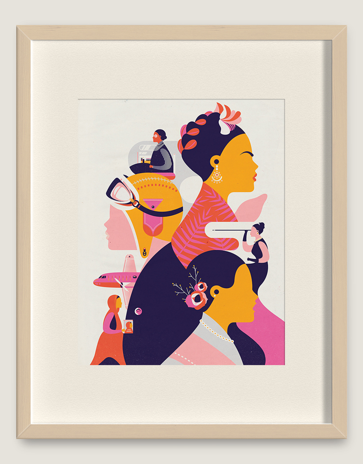
I just love her work! As stated on her website,“Her works are known for their clean lines and vibrant colours, which are held together by simple but thought provoking ideas.” Those clean-cut lines and the bright, bold colors are exactly what drew to me her work after reading about her. Her illustration style has been an influence to me in my own work. As an American-born Indian, I admire her adapting approach to different design work which she says is a result of being “raised in a multicultural society and having moved between different countries.” She attributes this in helping her “better understand a brief from different backgrounds and apply the design style most appropriate for it.” I feel like that I somewhat lack that understanding, but hopefully, one day with more experience, I too will be able easily adapt my design approach as a project demands. And finally, I love her philosophy of following your gut, making your own mistakes, and defining success in your own terms rather than someone else’s.

Check out more of her work here!

Source: https://www.commarts.com/fresh/elen-winata

Image: From Communication Art’s website

Hari & Deepti & Their Paper Dioramas

Uncategorized

I first came across the work of Hari and Deepti almost a year and half ago on Pinterest. They both are originally from India, but moved to Denver some years ago. Hari is a trained graphic designer and illustrator, and he was the senior designer for MTV Networks India. Deepti is an interaction designer for a leading telecom company. Together, they have created outstanding art with paper cutting and light, as well as sculptures out of paper clay. Paper is their medium because they find that since stories have many shades and a certain depth to them, paper has the precise qualities to reflect and to interpret them.

It is their firm belief that:

“Paper is brutal in its simplicity as a medium. It demands the attention of the artist while it provides the softness they need to mold it in to something beautiful. It is playful, light, colorless and colorful. It is minimal and intricate. It reflects light, creates depth and illusions in a way that it takes the artist through a journey with limitless possibilities.”

I love how their work isn’t geared to one audience. They are really universal, and attract people of all ages. They’ve done amazing things with light and paper! Their works are all so intricate and detailed. However, at the same they have a minimalistic quality to them. Their work has been used as book covers and have been featured in many publications. When I first saw their work, I thought that all of their work was done in Illustrator. It was only when I did some more research on them that I found out that they hand cut paper to make up the design and used light to not only be a light source, but also a coloring effect, as well. They’re so skilled in the art of the paper cutting, and it’s just incredibly awesome what they’ve done with it!

Check them out here!

Instagram (Most frequently updated!)

Black Book Gallery

Facebook

Estrella Damm & FC Barcelona

Uncategorized

I came across a short article on the homepage of the Communications Arts website about a new ad campaign for a beer called Estrella Damm. Estrella Damm is brewed in Barcelona, Spain, so they asked a Spanish-based ad agency, ABM Serveis de Comunicació, to create an ad campaign. They wanted the campaign to show how this beer was the official beer of FC Barcelona. FC Barcelona is one of the major soccer clubs in the world. It also happens to be one of my favorite teams. ABM enlisted Lorenzo Petrantoni, an Italian illustrator, for his incredible illustrations that, “[c]aptured the energy, spirit, and vigor of one of football’s major teams.”

From the looks of these ads, they attract three audiences:

1. Barca fans

2. Estrella Damm drinkers

3. Barca fans who drink Estrella Damm

Petrantoni interestingly combined the type and images together in his illustrations to create an awesome ad. After checking out his website, I found that all of his illustrations have the same visual style. He strategically placed the text and the images to create the space. I like how the type and the images in the illustrations form a bigger image. The varying sizes of the type and the images make that bigger image. This, to me, makes the ad engaging and as a result, made me check out all the aspects of the ad. These advertisements have successfully communicated the beer as FC Barcelona’s official beer.

Comm Arts Article:

http://www.commarts.com/exhibit/estrella-damm-print-ads

Lorenzo Petrantoni’s Website (really cool illustrations!):

http://www.lorenzopetrantoni.com

Ai Weiwei: China’s Rebel

Uncategorized

Ai Weiwei was born in Beijing, China in the year 1957. He is a human rights activist and an outspoken critic of China’s authoritarian regime. In April of 2011, Weiwei was arrested by Chinese authorities and was isolated from the outside world for almost three months. After his release, the government prohibited him from leaving Beijing for one year and he was also not allowed to travel without government permission. As a result, he became China’s symbol for the struggle of human rights in China.

Ai is greatly influenced by the works of Andy Warhol, Marcel Duchamp, and Jasper Johns. In fact, he spent his formative years as artist in New York City during the ‘80s when Warhol was considered a god. In a Smithsonian Magazine article, he basically said that this experience allowed him to understand how to “combine his life and art into a daring and politically charged performance that helps define how we see modern China.” He has gained an international audience with his work. He doesn’t really have a particular visual style either in any of his work. He tends to venture into different mediums such as sculpting, photography, architecture, and even social media to deliver his social message.

So why am I writing about him? Because I’m going to see his new exhibit at the Andy Warhol Museum next week. I came across his work for the first time when I was doing my preliminary research on art censorship for my English final last year. I like how all of his works have some social message behind it. I also admire the fact that he doesn’t stick to one platform or genre to get his message out to the world. One of my favorite works of his is Sunflower Seeds (2010). This was an installation made up of millions of small, identical but unique works that were hand-crafted in porcelain. Ai decided to have these seeds made out porcelain because it is widely associated with China. Ai’s message for this installation was to take closer look at the whole “Made in China” sensation in the world and to take a look at the geopolitics of cultural and economic exchange. Ai Weiwei is a brave man to stand up against the harsh Chinese government with his artworks. He truly is China’s rebel artist.

Here are some his works:

Note: The featured image is Ai Weiwei’s Dropping a Han Dynasty Urn (1995).

Sources:

http://www.smithsonianmag.com/arts-culture/is-ai-weiwei-chinas-most-dangerous-man-17989316/?no-ist

http://www.smithsonianmag.com/arts-culture/ai-weiwei-on-his-favorite-artists-living-in-new-york-and-why-the-government-is-afraid-of-him-30139964/

http://www.tate.org.uk/whats-on/tate-modern/exhibition/unilever-series-ai-weiwei-sunflower-seeds

http://www.theartstory.org/artist-ai-weiwei.htm

The Inkquisitive Amandeep Singh

Uncategorized

Amandeep Singh (aka Inkquisitive) is a London-based graphic illustrator and artist. I came across his work by one of older sisters, Pooja, a few years ago. Since then, I have been following his work via his Facebook page and his Instagram account. Singh graduated from the University of Hertfordshire in 2009 where he studied illustration. He does a lot of editorial art as well as religious art, but is mostly inspired by today’s pop culture. He became famous after R&B singer, The Weeknd, was made aware of Amandeep’s awesome illustration himself. The Weeknd then responded online on the work by asking, “Who did that, dope art.” He has also been featured in some YouTube videos of Superwoman.

What I really like about his work is his visual style. All of his illustrations are all done in bright and vibrant ink colors to create a watercolor to them. I love how his work ranges from great Sikh warriors to hip-hop legends to movie stars to President Obama. His work tends to draw attention from no particular audience nor does his work stays in one genre category. Amandeep’s works have no particular message either. He’s just paying his tribute the subject in a creatively different way.

Overall, I think is his work is amazing. He portrays each subject of his, be it an actor or a religious figure, in a unique way using ink. He’s described his work as being a “controlled chaos” and as being “imperfectly perfect.” That being said, I don’t find anything I’d want to change in his work because the imperfections of this work created the end results.

Check out more of his work here.

The Battle of the Book Covers

Uncategorized

I was grocery shopping at my local Giant Eagle when I decided to stop and look at book section there. I was delighted to see that they had the book Me Before You*. I really wanted to read this book, so I picked up the book cover on the left. But I was walking away, I spotted the book cover with the stars of the movie. I quickly placed the first book down, and took the cover with Emilia Clarke and Sam Claflin instead.

Now there wasn’t anything wrong with the original book. I really like the typography on the cover. I like how the letters move your eyes across the cover. The designer displays excellent hierarchy with letter height changes and color. I think the designer wanted to attract women who love a good romance novel with the colors. The title really pops on the page, especially the words ‘me’ and ‘you’. This cover is more typography driven and I love that, except it doesn’t really show or represent anything to me about the story.

The cover with the movie’s stars, however, interested me more. Why? Well, it gave me a preview of the movie and the ability to imagine the main characters nicely as I read. I personally prefer to buy the books with movie adaption’s stars on it so I can picture them instead of a blank face in my head. I also like the typography on this cover as well. I don’t really like serif fonts but this was an exception. The simple ligature between the letters ‘m’ and ‘b’ move your eyes to the rest of the title words. This cover still draws attention a female audience, but also to an audience who like the stars in their other roles (Game of Thrones and The Hunger Games). I happen to fall in both categories.

Both of these covers make great use of the space. They both move your eyes across the page thanks to their respective typefaces. They show text hierarchy and emphasize the important words on the page. However, one cover is type heavy, whereas, the other one greatly combines text with imagery. I like both covers, but the addition of imagery on the front cover made a great difference in my book purchase.

P.S. I may have also bought book because Khaleesi and Finnick Odair were on the cover! 😉

*Both covers were for Penguin Books, but the original cover is designed by de Vicq Design.

A Movie Poster With An Attitude

Uncategorized

When I first saw this poster for the Bollywood movie, Tevar (English: Attitude), last year I was amazed. I was really fascinated to this poster because of the multiple exposures making up the face the movie’s hero. I thought it was really cool and different from any movie posters (Hollywood and Bollywood) I’ve seen. Interestingly enough, the poster was designed by the actor in the poster himself, Arjun Kapoor. He designed the poster so he could appeal to a teenager/young adult movie audience. I would say he was successful because it made me want to watch this movie even before I watched the trailer itself. Also, the whole poster, to me, screams attitude with rustic color palette and the brush like typography. It’s young and bold and exactly what one would expect with title like Tevar. But as amazing as this first poster was, the following promotion posters for this movie weren’t as appealing. I would have liked to seen a series of this particular poster with the heroine’s and villain’s face being made up of multiple images. I think that would have been more appealing than the other promotion posters.

P.S. The movie wasn’t all too great. The songs though were really good!

tevar-story-size_650_101414105553

The Force Is Strong With This Packaging

Uncategorized

I had just binged watch all the Star Wars movies (except for Star Wars: The Force Awakens) when I came across this particular packaging on Pinterest. I was drawn to these coffee cups for the obvious reason: Darth Vader (aka Anakin Skywalker). Once clicking on the actual link from the pin itself, I found out that this package and brand are just conceptual designs (sad!) for a hypothetic coffee company called Dark Brew Coffee House. It was designed by two Seattle-based designers, Spencer Davis and Scott Schenone. The company’s tagline sticks to the Star Wars concept as well: “A coffee house with a dark side.” The targeted audience for this brand were Star Wars fans who are both coffee drinkers and “force-sensitive” to dark side. The coffee cups also featured adapted Star Wars quotes.

I think they have successfully combined two of the greatest things people have provided to us: Star Wars and coffee. I find the idea of drinking coffee from Darth Vader and Stormtrooper coffee lids awesome! You totally get the feeling of the dark side with the cup lids and quotes because they are all considered to part of the dark side. I would have never thought of using Star Wars has a branding and packaging approach to coffee! It’s a shame that this doesn’t really exist!

Sources:

http://www.packagingoftheworld.com/2015/12/dark-brew-coffee-house-concept.html

http://www.foodandwine.com/fwx/drink/star-wars-coffee-brew-dark-vaders-heart

Behance Page for Spencer Davis and Scott Schenone:

https://www.behance.net/spencedvs

https://www.behance.net/ScottSchenone

b94b8f0c9818152b317e4b03e579324d

Penguin Pocket Books!

Uncategorized

I came across this BuzzFeed article on my Facebook news feed the other day about 18 beautifully designed book covers from the new Pocket Penguin Series. I LOVE looking at book covers! In fact, my favorite project from Typography I is my To Kill A Mockingbird redesigned book cover. From reading article I found out that these books consist of famous and not so famous classic novels that were pulled deep from the archives of Penguin Books. I also found out these books are also small enough for you to carry in your back pocket, ergo the name, “Pocket Penguins.” But what was really interesting for me was how simplistic these book covers really are because They all have the same layout on the front and back covers. The front covers consist of two bold blocks of color and basic book cover info (author and title) but have the publisher smack dab in the middle separating the two color blocks and the book number at the bottom. On the back, front cover color is seen by font color of the quote and Penguin Books logo. Colors are consistent and adhere to a color-coding system based on the publishing origins (ex. orange= English; red= Russian; purple= French). Based on the minimalist style, it’s safe to say that the covers are for an audience who want a pocket sized book. Overall, I think they have a successful type pairing happening. Also, the covers make excellent use of the white space to draw in attention from the front to the back. I would definitely buy one of these books.

BuzzFeed Article: https://www.buzzfeed.com/danieldalton/pocket-penguins?utm_term=.vgeOb2erjW#.gl7gPl7Bz3

Watson Design Group & Their Movies

Uncategorized

As I was reading the May-June 2016 edition of Communication Arts today on my iPad, I came across an interview article with Watson Design Group’s chief creative director and founder, Fernando Ramirez by Sam McMillan. I was interested in the fact that Watson Design Group (Watson/DG) is an LA-based website design company that primarily design websites for various movie productions. According to the article, Watson/DG has become “the go-to design studio for franchise-promoting websites.

This article shows some screenshots of the websites they’ve done for the movies: Cinderella, Grand Budapest Hotel, Birdman, Big Hero 6, Ex Machina, Amy, and The Hunger Games franchise. I noticed they designed each website with the intended movie going audience in mind. For example, the website for Big Hero 6, is bright, eye-catching, and childlike. Ramirez stated that wanted “each of the heroes [to] shine” and wanted to “put them front and center so audiences could begin to get a feel for the film and form a connection.” However if you to take a look that Cinderella website, you see them designing a website emphasizing the ideas of independence and courageousness and trying to have the audience step away from the highly controversial thought of this Cinderella’s nineteen-inch waist. In the end, they created a Tumblr website that combined the concepts of “fairy tale with action-oriented exhortations of self-esteem” using messages saying, “Kindness and Magic,” “Fearless,” and “Destined for Greatness” against landscapes that keep focusing on the story itself.

I think each website they’ve designed work for the film nicely. The sites effectively promote and add a hands-on experience for the viewer. They’ve geared each website to the movie’s intended audience, but they’ve also made it that any one of any age group can be attracted to it. But what really stood out to me was the way that Ramirez and his team set goals for each of there websites. With Big Hero 6 they wanted to take movie site and enhance with WebGL* and video interstitials to take it to a new level. However, with The Hunger Games franchise, their goal was to emphasize greatly on Katniss Everdeen (The Girl On Fire!!) with an epic 3D WebGL experience where visitors could see never-before-seen motion posters, original imagery, and video clips and GIFs.

*WebDL is a real-time graphics library that enables the use of advanced 3D visuals, games, and data visualization in a web browser.

P.S. Click on the images below to view full size!