Dunking the Sun

Photography

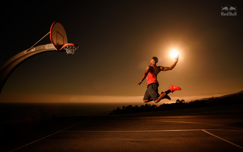
This was another photograph that I saw in Communication Arts that I just had to share. This was taken by Dustin Snipes for an ad campaign for Red Bull Media House. It features NBA player, Anthony Davis, in the middle of dunking a basketball sun. I found this shot to be very smart. I like how the sun is purposely being used as a ball. I like the tone of the shot, too. It really brings out an evening feel to the photograph, even though they were taken in the early morning. The photo also attracts basketball lovers and sports lovers as well. However, I don’t really understand how this shot relates to Red Bull. Red Bull’s tagline is that it “Gives you wings,” except I don’t see that in this photo. I guess because Davis is in a jumping pose, you get the idea of him flying, but even then, I don’t see anything that screams Red Bull to me. Overall, I found this photograph to be really cool because you never really see anyone dunking the sun ever. The photographer really made great use of his location (San Pedro, CA), and the time of the day, as well.

To see more photos from this ad campaign click here.

Photograph taken off of the Red Bull website.
display.jpeg

Estrella Damm & FC Barcelona

Uncategorized

I came across a short article on the homepage of the Communications Arts website about a new ad campaign for a beer called Estrella Damm. Estrella Damm is brewed in Barcelona, Spain, so they asked a Spanish-based ad agency, ABM Serveis de Comunicació, to create an ad campaign. They wanted the campaign to show how this beer was the official beer of FC Barcelona. FC Barcelona is one of the major soccer clubs in the world. It also happens to be one of my favorite teams. ABM enlisted Lorenzo Petrantoni, an Italian illustrator, for his incredible illustrations that, “[c]aptured the energy, spirit, and vigor of one of football’s major teams.”

From the looks of these ads, they attract three audiences:

1. Barca fans

2. Estrella Damm drinkers

3. Barca fans who drink Estrella Damm

Petrantoni interestingly combined the type and images together in his illustrations to create an awesome ad. After checking out his website, I found that all of his illustrations have the same visual style. He strategically placed the text and the images to create the space. I like how the type and the images in the illustrations form a bigger image. The varying sizes of the type and the images make that bigger image. This, to me, makes the ad engaging and as a result, made me check out all the aspects of the ad. These advertisements have successfully communicated the beer as FC Barcelona’s official beer.

Comm Arts Article:

http://www.commarts.com/exhibit/estrella-damm-print-ads

Lorenzo Petrantoni’s Website (really cool illustrations!):

http://www.lorenzopetrantoni.com